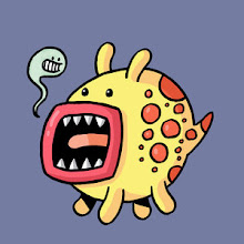
I'm a huge fan of vector art and have constantly been told by people that my work would translate well to vector images. I've been meaning to give it a go but it's being able to take the time to learn Illustrator (I use Photoshop) and try and perfect a new technique. There's just one problem I have with vector work and that is that it seems to really be dominating the illustration and design industry at the moment so what would possibly make mine stand out if I went vector?
The fact is, I love the hand drawn look. I love wonky lines and a slightly "imperfect" look as I think it has a charm that vectorisation just can't capture. But then comes the question: Am I shooting myself in the foot by not jumping on the vector bandwagon and sticking with freehand work? This has been a big worry for me over the last few months as vector work is used everywhere. I recently had a meeting with the company Trunki and voiced this concern and was told not to change my artistic style as it worked very well. I was glad they said this as it meant they chose to see me based on my style.
Does anyone else feel the same about their artwork? I feel I'd lose something if I vectorised everything but maybe that's what clients want at the moment; a more uniform look to artwork than wobbly lines.
Any comments on this would be very much appreciated!


The main advantage aside from the stylistic/aesthetic element of vector illustration work is the flexibility and scalability of the linework - so you could theoretically take a vector image and scale it to 1% or up to 1,000,000% and it would still look the same, whereas bitmap images, even with high scan resolutions, are still prone to compression arefacts due to the way they're arranged. I would say that a large proportion of professional graphic design/illustration work is now vector based for speed and ability to alter work without having to redraw as well - but I don't think it's a necessity. The majority of interviews in Computer Arts all say they start in pencil/ink and then trace over it with a vector path in Illustrator. I guess what I'm getting at is if you haven't felt the need to switch to that kind of style and you don't have the requirement within a brief to produce massively scalable artwork, I'd keep doing what you're doing dude!
ReplyDeleteIt's more the actual style of art with flat colours and shapes I meant; I'm not as disagreeing with the technical aspect!
ReplyDeletei go throught this same argument at least once a month.. on the one hand if I vector my stuff it has a glossy/shiny finish which apparently looks more professional.. but i feel any character that my pencil sketch once had is lost in the digital translation..
ReplyDeletethe majority of my folio is vectored artwork and i personally feel nothing for it anymore.. but it did all start with a pencil drawing.. i only vectored my stuff as I dont know what to do with it (colour-wise) without getting it onto the computer..
i personally think all vectored artwork has started to blend into one another now.. i can pick out 5 different images and they look like they were all made by the same person. Your work WOULD lend itself to vectors very well.. but i can almost guarantee you that it wouldnt have the same "feeling"..
crap.. jsu saw what date this was originally published.. ooops.. it was a "recommended" read from your latest post.. feel free to ignore.
ReplyDelete